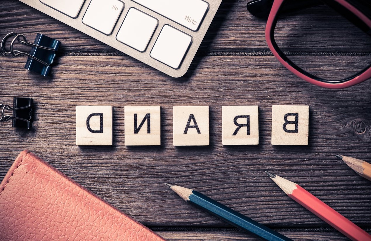
Choosing the right font pairing for logos is one of the most underrated decisions in branding. A great combination creates hierarchy, communicates personality, and makes your mark instantly recognizable. A bad one makes even a clever symbol look amateur.
In this guide, we share 8 font pairings that work in 2026, tested across real client projects at FF2D. Each pairing comes with the reasoning behind it (contrast, mood, industry fit) and a concrete use case so you can apply them to your own logo work today.
Why Font Pairing Matters in Logo Design
A logo often combines a brand name with a tagline, a descriptor, or a secondary line. When two typefaces sit side by side, they need to do three things at once:
- Create contrast so the eye knows what to read first
- Share a mood so the brand feels coherent
- Fit the industry so customers recognize the category at a glance
The classic rule still applies: pair fonts that are different enough to contrast but similar enough to harmonize. Mix a serif with a sans serif, a bold with a light, or a wide with a narrow, but keep proportions and x-heights compatible.
The 8 Best Font Pairings for Logos in 2026
1. Playfair Display + Inter
Mood: Editorial, premium, trustworthy
Best for: Fashion, real estate, consulting agencies
Playfair Display brings the high-contrast serif elegance of editorial magazines, while Inter keeps the secondary line clean and modern. The contrast between thick and thin strokes in Playfair plays beautifully against Inter’s neutral geometry.
Use case: A boutique fashion label using Playfair for the brand name and Inter for the tagline “Atelier since 2019”.
2. Space Grotesk + IBM Plex Mono
Mood: Technical, confident, future-forward
Best for: SaaS, AI startups, fintech
This pairing has become a go-to for tech brands in 2026. Space Grotesk is friendly but structured, while IBM Plex Mono adds a developer-friendly accent that signals “we build things”.
Use case: An AI infrastructure startup using Space Grotesk for the wordmark and Plex Mono for a version tag like “v.2026”.
3. Cormorant Garamond + Montserrat
Mood: Refined, balanced, hospitable
Best for: Restaurants, wineries, hotels
Cormorant offers slim, classical letterforms that feel curated. Montserrat grounds the pairing with geometric stability. The result is welcoming without being stiff.
Use case: A farm-to-table restaurant using Cormorant for the name and Montserrat in tracked-out caps for “Kitchen & Bar”.
4. Archivo Black + Archivo
Mood: Bold, modern, accessible
Best for: Sports brands, media, podcasts
Pairing fonts from the same family is the safest move when you want guaranteed harmony. Archivo Black brings the impact, Archivo Regular handles the supporting copy. Same skeleton, different weight.
Use case: A sports media outlet with a heavy block logotype and a clean descriptor underneath.
5. Fraunces + Manrope
Mood: Warm, contemporary, expressive
Best for: Wellness, beauty, lifestyle brands
Fraunces is a variable serif with a charming softness, perfect for brands that want personality without losing sophistication. Manrope balances it with rounded geometric calm.
Use case: A skincare brand using Fraunces for the name and Manrope for product line names.
6. Bebas Neue + Lora
Mood: Strong, narrative, grounded
Best for: Coffee shops, breweries, artisanal food
Bebas Neue is a vertical condensed sans that screams from the page. Lora softens it with a humanist serif that feels handcrafted. Together they tell a small-batch, story-driven brand.
Use case: A specialty coffee roaster with a tall “BEAN & BARK” wordmark and “Roasted in Lyon” in Lora italic.
7. DM Serif Display + DM Sans
Mood: Versatile, trustworthy, premium-friendly
Best for: E-commerce, agencies, B2B services
Designed to work together, this duo delivers built-in harmony. The serif is high-contrast and confident, the sans is neutral and legible at every size, including favicons.
Use case: A digital agency using DM Serif Display for its name and DM Sans for the descriptor “Brand & Product Studio”.
8. Syne + Satoshi
Mood: Creative, distinctive, design-forward
Best for: Creative studios, fashion-tech, art galleries
Syne has unusual geometry that grabs attention without being gimmicky. Satoshi is a clean modern sans that lets Syne be the star. Perfect for brands that want to feel different.
Use case: A creative studio using Syne for the logotype and Satoshi for navigation labels.
Quick Reference Table
| Pairing | Industry Fit | Mood |
|---|---|---|
| Playfair Display + Inter | Fashion, consulting | Editorial, premium |
| Space Grotesk + IBM Plex Mono | SaaS, AI, fintech | Technical, modern |
| Cormorant + Montserrat | Restaurants, hotels | Refined, hospitable |
| Archivo Black + Archivo | Sports, media | Bold, accessible |
| Fraunces + Manrope | Wellness, beauty | Warm, expressive |
| Bebas Neue + Lora | Coffee, breweries | Strong, artisanal |
| DM Serif Display + DM Sans | B2B, e-commerce | Versatile, premium |
| Syne + Satoshi | Creative studios | Distinctive, modern |
5 Rules to Keep in Mind When Pairing Fonts for a Logo
- Limit yourself to two fonts. A third typeface in a logo almost always creates noise.
- Test at small sizes. Your logo will appear on favicons, app icons and social avatars. If it falls apart at 32px, the pairing is wrong.
- Mind the x-height. Fonts with very different x-heights look mismatched when stacked.
- Decide the hierarchy first. Which word should be read first? Choose the bolder font for that role.
- Check licensing. Most fonts above are free via Google Fonts or have permissive licenses, but always verify before commercial use.
Common Mistakes to Avoid
- Pairing two display fonts that compete for attention
- Mixing two serifs from different historical periods
- Using fonts with nearly identical weight and width (no contrast)
- Picking trendy fonts that will feel dated by next year
- Ignoring how the pairing looks in single color and reversed
FAQ
How many fonts should a logo use?
Two is the sweet spot. One font can feel flat, three usually creates visual chaos. Stick to two and rely on weight, size and spacing to add variety.
Can I pair two serifs or two sans serifs?
Yes, but it requires care. Make sure they differ clearly in weight, width or proportion. Pairing two similar serifs is the most common rookie mistake.
Are Google Fonts good enough for professional logos?
Absolutely. Many of the pairings above use Google Fonts and are used by professional studios. The license is free for commercial use, which is a major advantage.
Should the logo font match the website font?
Not necessarily, but they should belong to the same visual world. Many brands use the logo typeface only in the logo, then choose a more legible body font for the website.
What is the safest font pairing for a new brand?
Pairings from the same family, like Archivo Black with Archivo, or DM Serif Display with DM Sans, are the safest because they are designed to work together.
Final Thoughts
The best font pairing for a logo is the one that fits your brand’s voice, scales cleanly across every touchpoint, and still feels right two years from now. Use the eight combinations above as a starting point, test them with your actual brand name, and refine until the typography does the talking before the words even register.
Need help building a logo system that holds up across web, print and product? The FF2D team is here to help.