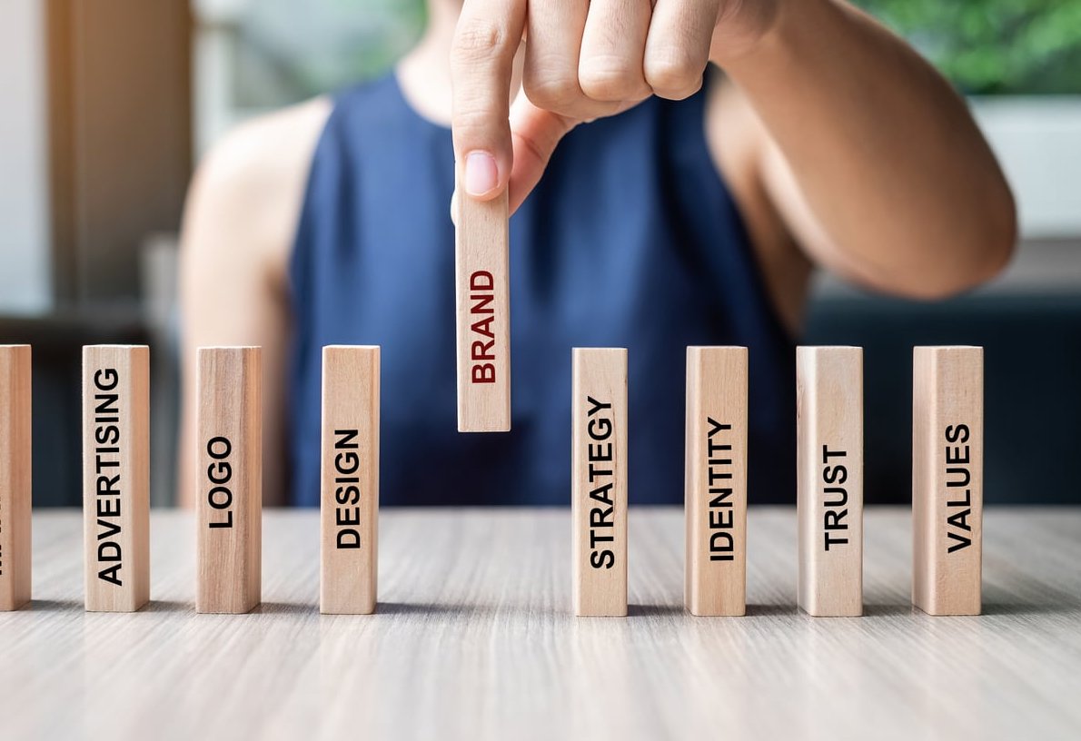
A brand style guide is the single source of truth that keeps every touchpoint of your business looking, sounding, and feeling consistent. Without one, your designers, marketers, and external partners end up guessing, and your brand slowly loses its edge. With one, every email, landing page, social post, and packaging design reinforces the same identity.
In this guide, we walk you through how to create a brand style guide from scratch using the exact 10-section template professional brand designers rely on. For each section, you will learn what to include, why it matters, and which real-world brand guidelines you can study for inspiration.
What Is a Brand Style Guide (and Why You Need One)
A brand style guide, sometimes called brand guidelines or a brand book, is a document that defines the rules for how your brand is presented visually and verbally. It typically covers logo usage, colors, typography, imagery, tone of voice, and application examples.
Companies that maintain consistent branding across all channels can see revenue growth of up to 23%, according to research compiled by Lucidpress. Beyond revenue, a style guide:
- Speeds up design and content production
- Prevents off-brand work from agencies and freelancers
- Protects brand equity as your team scales
- Makes onboarding new hires significantly faster
Before You Start: Gather These Brand Foundations
Before opening Figma or InDesign, collect the following inputs. Your guide will only be as strong as the strategy behind it.
- Brand strategy document (mission, vision, values)
- Audience personas
- Competitor positioning
- Existing logo files and design assets
- Tone of voice notes from founders or marketing leads

The 10-Section Brand Style Guide Template
Here is the structure we use on every branding project at FF2D. Follow it in order, because each section builds on the previous one.
| Section | Purpose |
|---|---|
| 1. Brand Story & Mission | Set the strategic foundation |
| 2. Logo System | Define every logo variation and rule |
| 3. Color Palette | Lock in primary, secondary, and accessibility values |
| 4. Typography | Establish hierarchy and pairing rules |
| 5. Imagery & Photography | Set the visual mood and selection criteria |
| 6. Iconography & Illustration | Standardize supporting graphic elements |
| 7. Voice & Tone | Codify how the brand sounds in writing |
| 8. Layout & Grid | Govern composition and spacing |
| 9. Applications & Examples | Show the system in real-world use |
| 10. Asset Library & Governance | Make assets accessible and maintained |
1. Brand Story & Mission
Open your guide with the why. Include a short brand narrative, the mission statement, vision, and three to five core values. This grounds every visual decision that follows.
Real example: The Netflix brand guidelines open with a one-line story about why the brand exists before showing a single logo.
Include:
- Brand origin story (3 to 5 sentences)
- Mission and vision statements
- Core values with short descriptions
- Brand personality traits (e.g., bold, warm, expert)
2. Logo System
This is the most-referenced section in any guide. Cover every legitimate way the logo can appear, and every way it cannot.
Include:
- Primary logo
- Secondary and stacked versions
- Monogram or favicon mark
- Clear space (usually defined in x-height)
- Minimum sizes for print and digital
- Approved color versions (full color, mono, reversed)
- Logo misuse examples (stretched, recolored, drop-shadowed)
Real example: The Spotify Design site shows exactly how their wordmark must appear on light, dark, and photographic backgrounds, with eight common misuses called out explicitly.
3. Color Palette
Define a primary palette, a secondary palette, and neutral tones. Always include HEX, RGB, CMYK, and Pantone values, plus accessibility ratings.
Include:
- Primary colors with usage percentages
- Secondary and accent colors
- Neutrals (backgrounds, text)
- WCAG contrast pairings for accessibility
- Color proportion guide (e.g., 60-30-10 rule)
Real example: The IBM Carbon design system publishes contrast tokens for every color pair, making it easy for developers to stay accessible.
4. Typography
Typography defines tone as much as voice does. Lock in headline fonts, body fonts, and fallback web-safe options.
Include:
- Primary typeface with weights and styles
- Secondary typeface (if needed)
- Type hierarchy: H1 through H6, body, captions
- Line height, letter spacing, and paragraph spacing rules
- Web fallback fonts
Real example: The Atlassian Design System shows typography tokens with exact pixel sizes and use cases for product UI versus marketing.
5. Imagery & Photography
Set the mood and selection criteria so anyone can pick on-brand visuals without guessing.
Include:
- Photography style (natural light, editorial, studio)
- Subject matter rules (people, products, environments)
- Color treatment and filters
- Examples of on-brand vs off-brand images
- Stock photo guidance or banned sources
Real example: Airbnb’s guidelines specify that photos must feel “lived in” and shot from the perspective of a host, which immediately filters out generic stock imagery.
6. Iconography & Illustration
Define stroke widths, corner radii, grid sizes, and illustration style so all supporting graphics feel like they come from the same family.
Include:
- Icon grid (typically 24×24 or 32×32)
- Stroke weight and corner radius
- Filled vs outlined usage rules
- Illustration style samples
- Color application within illustrations
7. Voice & Tone
Show how the brand sounds in writing. Voice is constant, tone shifts by context.
Include:
- Three to five voice attributes (e.g., confident, warm, plainspoken)
- “We say / we don’t say” comparison tables
- Tone adjustments by channel (support, marketing, legal)
- Grammar and punctuation preferences
- Vocabulary do’s and don’ts
Real example: Mailchimp’s Content Style Guide is the gold standard, with detailed tone shifts depending on whether a user is succeeding or hitting an error.
8. Layout & Grid
Composition rules keep marketing materials feeling cohesive even when produced by different designers.
Include:
- Grid systems for print and web
- Margin and padding rules
- Alignment principles
- Whitespace expectations
9. Applications & Examples
Show the system applied to real assets: business cards, social posts, ad banners, presentation slides, email templates, packaging, and signage. This section turns rules into recognizable patterns.
10. Asset Library & Governance
End with the practical stuff: where to find the assets and who owns the brand.
Include:
- Link to a DAM or shared drive with logos, fonts, templates
- Version number and last updated date
- Brand owner contact for approvals
- Review cycle (we recommend every 12 months)

Tools to Build Your Brand Style Guide in 2026
| Tool | Best For |
|---|---|
| Figma | Living, interactive guidelines |
| Notion | Lightweight, easily updated docs |
| Adobe InDesign | Polished print-ready PDFs |
| Frontify / Bynder | Enterprise brand portals |
| Canva | Small teams and quick first versions |

Common Mistakes to Avoid
- Making it too long. A 120-page PDF nobody reads is worse than a 20-page guide everyone uses.
- Skipping misuse examples. People learn rules faster when they see what not to do.
- Forgetting accessibility. Color and type choices must meet WCAG 2.2 contrast standards.
- Treating it as static. Your guide should evolve at least once a year.
- Ignoring voice. Many guides cover visuals beautifully but skip how the brand sounds.
FAQ
How long should a brand style guide be?
For most small and mid-sized businesses, 20 to 40 pages is the sweet spot. Enterprise brands often run 80 pages or more, but only because they cover multiple sub-brands and product lines.
What should a brand style guide include at minimum?
At a bare minimum: brand mission, logo usage, color palette, typography, and voice and tone. Everything else strengthens the system but these five are non-negotiable.
How much does it cost to create a brand style guide?
DIY using a template can cost under 200 euros. A freelance designer typically charges between 2,000 and 8,000 euros. A full agency engagement with strategy can range from 15,000 to 60,000 euros or more.
How often should I update my brand style guide?
Review it every 12 months and update it whenever you launch a new product line, enter a new market, or run a brand refresh.
Can I create a brand style guide without a designer?
Yes, especially for early-stage businesses. Tools like Canva, Notion, and Figma community templates make it possible to ship a credible v1. Plan to bring in a professional once your brand starts scaling across multiple channels.
Final Thoughts
A brand style guide is not a vanity document. It is an operational asset that pays for itself every time a designer, writer, or partner makes a confident on-brand decision without asking. Start with the 10 sections above, ship a v1 in two to three weeks, and refine from there. Your future team will thank you.
Need help building a brand system that scales? The FF2D team designs brand guidelines used by startups and global teams alike. Get in touch to start the conversation.
