Choosing the right free color palette generator for brand identity can save you hours of trial and error. After running dozens of real client projects through the most popular tools, we put together this hands-on comparison of seven generators, showing exactly when each one shines in a designer’s workflow.
Instead of listing features you can find on any homepage, we focus on the practical question: which tool should you actually open when you sit down to build a brand?
Quick Comparison: 7 Free Color Palette Generators
| Tool | Best For | AI Powered | Export Options |
|---|---|---|---|
| Coolors | Fast palette iteration | Partial | PNG, PDF, SVG, CSS |
| Khroma | Personalized brand moods | Yes | Image, hex |
| Adobe Color | Accessibility & color theory | No | ASE, CSS, Creative Cloud |
| Paletton | Classic color theory | No | HTML, CSS, image |
| Huemint | Website & product mockups | Yes | Hex, image |
| Colormind | Style-based palettes | Yes | Hex, image |
| Canva Palette Generator | Extracting from photos | Partial | Hex, direct to Canva |
1. Coolors: The Go-To for Rapid Iteration
Coolors remains the fastest tool when you need to explore dozens of directions in a single session. The spacebar shortcut lets you generate new palettes instantly, and locking individual colors makes it easy to build around a primary brand color the client has already approved.
When to use it
- Early-stage brainstorming with a client on a call
- Building variations around a fixed primary color
- Exporting quick PDF presentations for stakeholders
Real workflow example: For a fintech startup rebrand, we locked their existing deep navy and pressed spacebar until we found four supporting tones in under three minutes.
2. Khroma: When You Want a Palette That Feels Like You
Khroma asks you to pick 50 colors you love, then trains a small AI model on your taste. Every palette it generates afterward feels curated rather than random.
When to use it
- Boutique or personal brand projects where the designer’s taste matters
- Building a signature look across multiple client projects
- Escaping generic startup color trends
3. Adobe Color: The Serious Choice for Accessibility
Adobe Color is the only free tool in this list with a built-in accessibility checker that flags contrast issues against WCAG standards. For brand identity work that needs to hold up on web and print, this alone justifies its place in your toolkit.
When to use it
- Healthcare, government, or education brands with strict a11y requirements
- Building color systems with tertiary and accent colors
- Teams already using Creative Cloud
4. Paletton: For Designers Who Trust Color Theory
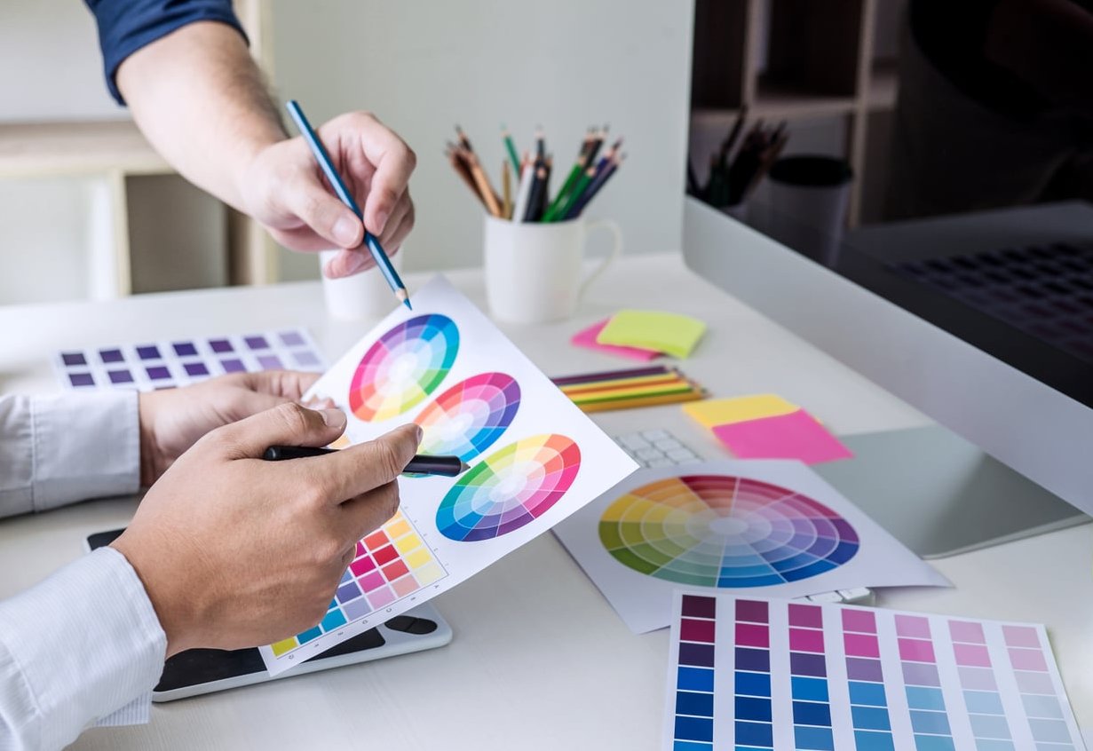
Paletton is the old-school choice, built entirely around the color wheel. You pick a base hue, then choose monochromatic, complementary, triadic, or tetradic relationships. No AI, no randomness, just pure theory.
When to use it
- Teaching junior designers how palettes are constructed
- Building brands where mathematical harmony matters (luxury, editorial)
- Testing how palettes render in preview mockups instantly
5. Huemint: The Best AI Tool for Website Brand Systems
Huemint generates palettes in the context of actual mockups: websites, brand illustrations, product cards, and 3D graphics. You see the palette applied, not floating on a white background.
When to use it
- SaaS and digital-first brands
- Presenting palette options with visual context to non-designers
- Generating palettes that need to work in real UI hierarchies
Real workflow example: On a recent B2B SaaS project, Huemint helped us decide between a warm and cool accent color by showing both applied to a dashboard mockup side by side.
6. Colormind: Style Transfer for Brands with a Reference
Colormind uses deep learning trained on photographs, movies, and design work. You can pick a style (film, art, web) and it produces palettes with that flavor.
When to use it
- Mood-driven brands (cinematic, editorial, vintage)
- Matching a brand to a specific visual era or movement
- Getting inspiration when you feel stuck

7. Canva Color Palette Generator: Best for Photo-Based Branding
Canva’s tool extracts palettes directly from an image you upload. It’s not the most sophisticated option, but it’s the fastest way to turn a mood board photo into a working palette.
When to use it
- Photography-led brands (hospitality, food, fashion)
- Clients who already work in Canva
- Extracting a palette from an inspiration image in one click
Which Tool Should You Actually Choose?
There is no single winner. The right tool depends on what stage of the brand identity process you are in:
- Exploration stage: Coolors or Khroma
- Concept validation: Huemint or Colormind
- System building: Adobe Color or Paletton
- Photo-driven brands: Canva
Most professional designers use two or three of these together. A common pipeline: brainstorm in Coolors, refine in Adobe Color for accessibility, then validate in Huemint mockups.
Tips for Using Any Color Palette Generator on Brand Projects
- Always test contrast before finalizing. Any palette that fails WCAG AA on your primary text is a dead palette.
- Limit yourself to 5 or 6 colors max. A brand system needs one primary, one or two secondaries, and neutrals. More than that becomes hard to maintain.
- Test in context. Palettes that look great as swatches often collapse when applied to a real interface or printed piece.
- Save hex codes with names. Document your palette from day one to avoid confusion later in the project.
FAQ
Is there a truly free color palette generator for brand identity?
Yes. Coolors, Adobe Color, Paletton, Huemint, Colormind, Khroma, and Canva all offer free tiers that are more than enough for professional brand work. Some, like Coolors, offer paid features (unlimited saves, brand kits) but the core generator is free.
Can AI color palette generators replace a designer?
No. AI tools like Huemint and Khroma are excellent for exploration, but a brand color system requires strategic decisions about hierarchy, accessibility, and cultural context that still need a human eye.
What is the best number of colors for a brand palette?
Most strong brand identities use between 3 and 6 colors: one primary, one or two secondaries, and one to three neutrals. Anything more becomes hard to apply consistently.
How do I make sure my palette is accessible?
Use Adobe Color’s accessibility tool, or run your primary text and background combinations through a WCAG contrast checker. Aim for at least 4.5:1 contrast on body text.
Should I start with a photo or from scratch?
If your brand is photography-driven (hospitality, fashion, food), start from a photo using Canva or Adobe Color. If your brand is more abstract or digital-first, start with a base hue in Coolors or Paletton.